How to create a high converting product page: a guide
This is my guide to creating a high converting sales page on Shopify.

Some of the things that make up a high converting Shopify page are actually a bit counter-intuitive. Across about four stores, I’ve done an analysis about which pages convert and which ones don’t, having installed a particular plugin (HotJar) which lets you watch how users actually behave on the site. We get a conversion rate of 4.3%, meaning that roughly for every 23 users that visits, one person will purchase. This is compared to the apparent industry standard for tech gear of 2.43%, meaning a 76.95% increase. To be fair, the confounding factor is that we put heavy emphasis on retargeting and high intent traffic…but regardless, I’d like to think our product pages still contribute a very significant amount to that number.
Here’s what I found tends to work.
First observations
Before even diving into the specifics, there’s a few really important observations to be aware of.
- Customers spend a very, very small amount of time looking at your product. There are heaps of customers that will click off the website in less than 15 seconds.
- The more interested customers will read a bit more into your descriptions.
- Customers do click on Returns and Warranty / Shipping pages.
Titles give a strong indication as to whether the customer even thinks about the product or not
Because it’s your own Shopify store, you don’t need to be particularly spammy with the way that you phrase your product titles. All you need to do is optimise for one thing: does this product solve what the customer is searching for?
An example would be, “Leather Gear Bag for Sony A6100 Camera”. You can include brand as well if you like, but if it’s a not-well-respected brand then sometimes I actually just leave this off.
A lot of the traffic that you eventually send to your store doesn’t necessarily go straight to the product page directly, but rather comes from traffic you send to a different product and clicks through into the product that actually ends up being sold. Often the best way is to have interrelated products that have a few variations on solving the customers problem. Not too many, just a few, so that the customer “warms up” to the idea of buying from your store. Their inner question therefore changes from “which store should I buy from?” to “which product from this store should I buy?” and that’s really good for you.
But the only way to get them to flow from one to the other is to have an enticing title that appears trustworthy and solves exactly what they’re looking for.
Keep descriptions short
I once had this absolutely gorgeous 10 page equivalent landing page that illustrated all the major benefits of a $200 product. It had animations, beautiful photography, gorgeous animations, neat typography, everything. By addressing every single one of my customer’s needs and thoughts, surely it would do better?
It tanked. Hard. In fact, only about 20% of customers went below the fold and actually scrolled down, and less than 5% scrolled more than a single page worth down.
In real life, the description serves to provide some support to the imagery. Again, you need to align it with user intent. Does this product solve the specific problem that the user is having?
That said, humans still do end up buying based on emotions over logic. I tend to do a kind of reverse search where I look at product pages I actually really like myself for similar products, and then pick out the words that I actually felt had contributed to my purchase of that product.
Obviously, make sure that everything is grammatically correct and flows well in terms of sentences. If you’re bad at writing, then it’s something you should consider enlisting some help for. There’s nothing that screams “shady” like a poorly written description.
An example of short descriptions in action is to actually look at Apple’s website. Not their major products - which have huge advertising pages - but actually, the accessories to their products. You’ll notice that even those accessories that cost a few hundred dollars, often don’t have more than a few paragraphs of text. And that’s because…
It’s actually photography which is king
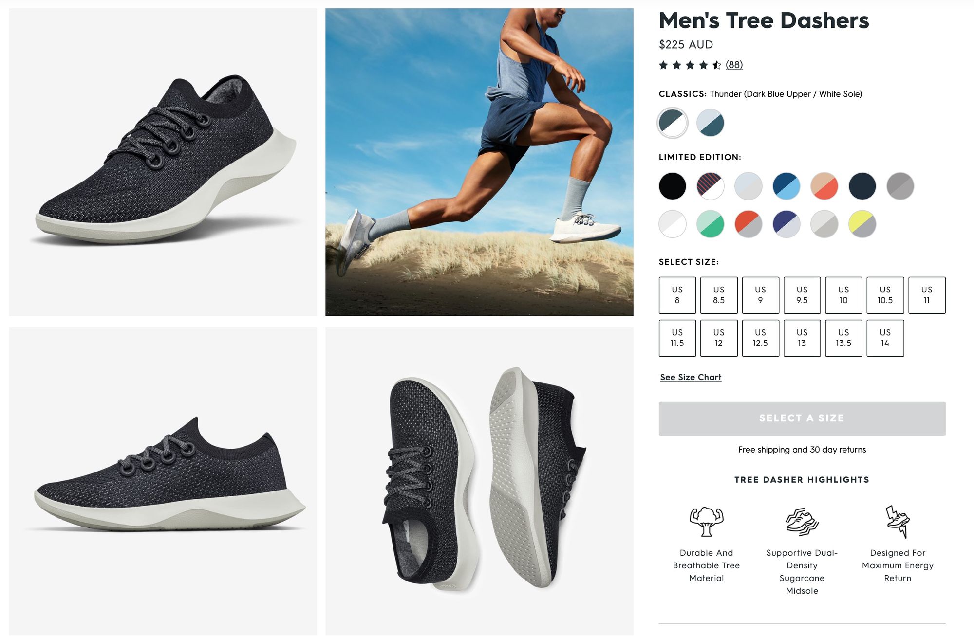
Clean, beautiful typography is the number one thing you can do to make your product sell. What I’ve specifically noticed is that whilst people don’t stay long at all to read the descriptions, a lot of the time they will look through every single image of your product if they’re actually going to purchase it. Out of all signals, I think that seeing someone look through all images is the number one thing that seems to correlate with them clicking Add to Cart.

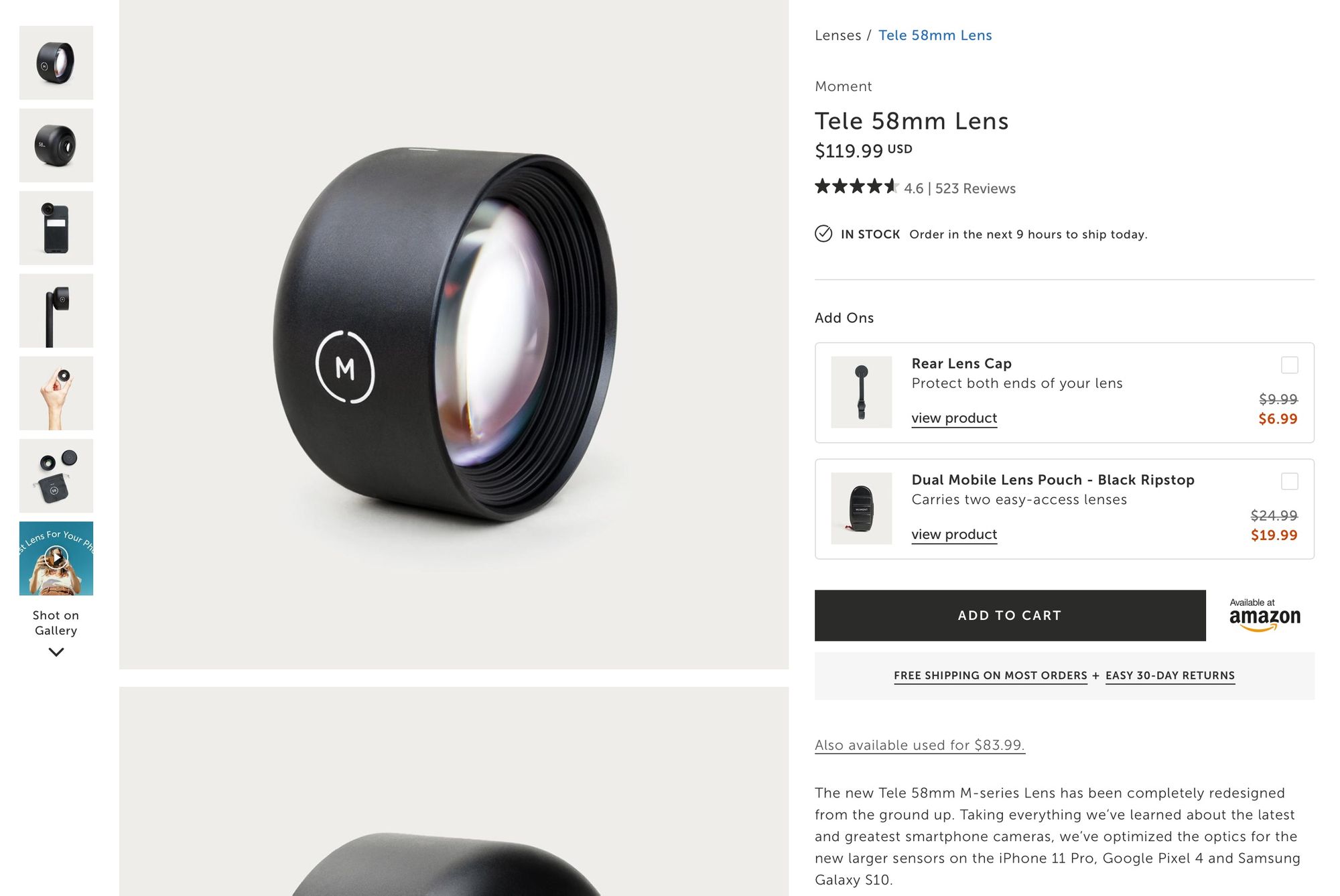
I tend to go for extremely clean product images with minimal backgrounds. It tends to work for me better than any fancy or aesthetic background I’ve implemented. That said, my niche is specifically in technology; if you’re e.g. doing an eCommerce store related to house decor, it might be better to create a few images of what it would look like in different places in the house. You should spend a bit of time just testing to see what works, I just find that minimalist backgrounds tend to trump anything else I put every single time.
You should definitely put multiple images, too.
For those who dropship from AliExpress, I think it’s actually much better to create your own photography. The AliExpress ones can look somewhat nice, but the clean uniform aesthetic across your whole site really gives a marked sense of professionalism that is often lost.
Chat box
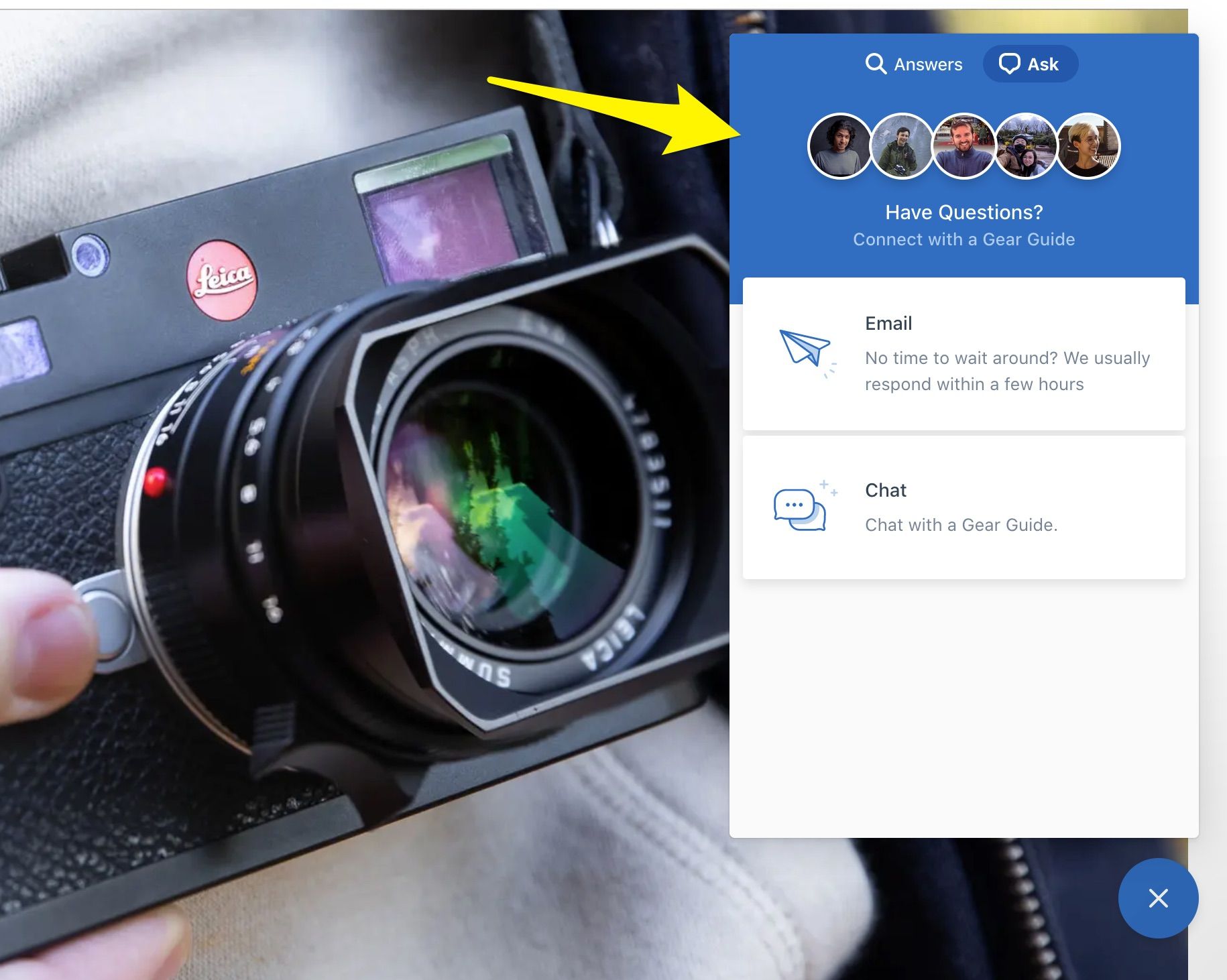
A chat box with a person’s face on it really helps increase customer trust. When you’re just starting, I find that if you chat to someone within the first 20 seconds or so of them asking a question, you can often move them directly towards buying with a surprisingly high hit rate. When I first started my store, maybe 30-40% of people I just was friendly to — and answered the questions of — would purchase. They’re already in a buying mood, so they need a little more help.
That said, as you scale this of course becomes hard to actually do. However, the trust signal that the chat box gives does make a significant difference. Just make sure that it is actually manned by someone.
There’s a major side benefit to having one. Customers will often suggest products that they’re looking to purchasing. So you literally just add those products to your store. We’ve definitely come across a few hit products on our store in this way.
Reviews
We tend to use YotPo Reviews, which is pretty great. I’ve never A/B tested a product page without one, so I couldn’t make a direct comparison, but having a lot of positive reviews just from watching friends in real life browse my store seems to make the big difference that you would assume. Often the comment is, “wow this looks legit”.
Something I want to eventually implement is User Generated Content. There’s an expensive upgrade to YotPo whereby users can upload images of their product purchased. To be honest, I actually don’t care too much about how this affects the product page, but the major major benefit is that if you do something like Facebook advertising you can use these images in your advertising and they tend to convert really well since they appear native to platform. Interestingly, they can often convert higher than professional photography does when used in advertising.
Conclusion
Creating a high converting product page is not necessarily correlated with spending extravagant amounts of efforts on ultra long descriptions, but instead with a blend of beautiful photography and an overall emphasis that this product is exactly the thing that the person is looking for. If you have to use a product description to convince someone your product is worthwhile, you’ve already lost. They will look at the images and title, decide whether or not they want to buy it, and then use the descriptions to justify the decision they’ve already pretty much made.
If you liked this post, consider signing up to my newsletter here! I’ll be sharing more about Shopify tips and tricks to help you make your store better.